Combating plastic pollution in Ghana's water bodies
My Role
Lead Designer
Year
2024
Scope of Work
Brand Design
Overview
Cleaner Waters Renewable Solutions LBG is a non-profit organization committed to combating plastic pollution in Ghana's water bodies with a focus on phasing out the impact it has on the nation's water resources.
Building the framework
The first step in building the CWRS brand was developing a strong brand framework—a strategic foundation that would guide all aspects of the brand’s identity and communication. This framework served as a blueprint, ensuring consistency and clarity in every brand-related decision.
The framework included:
Mission: Defining the brand’s purpose and the impact it seeks to create.
Vision: Outlining the long-term aspirations and goals of CWRS.
Core Values: Establishing the fundamental principles that drive the brand.
Brand Characteristics: Defining the personality, tone, and visual attributes that shape how CWRS is perceived.
By setting a clear and structured foundation, we ensured that every element of the brand—from design to messaging—aligned with its core identity and objectives.


Defining the Visual Language
The color palette for CWRS was carefully selected to align with the brand framework established earlier. Each color was chosen with intention, designed to evoke specific emotions and communicate key brand values to the audience. The goal was to create a visually cohesive identity that reinforced CWRS’s mission and vision.
In addition to color, patterns played a crucial role in shaping the brand’s visual language. These patterns were developed based on their ability to convey meaning and support the brand narrative. Since CWRS operates across two primary focus areas—cleaning the waters and providing renewable environmental solutions—the patterns were designed to reflect these themes. Fluid, wave-like designs symbolize water purification efforts, while structured, geometric elements represent sustainability and innovation in renewable solutions.
By integrating meaningful colors and patterns, we ensured that every visual element of CWRS contributed to a strong, recognizable, and purpose-driven brand identity.


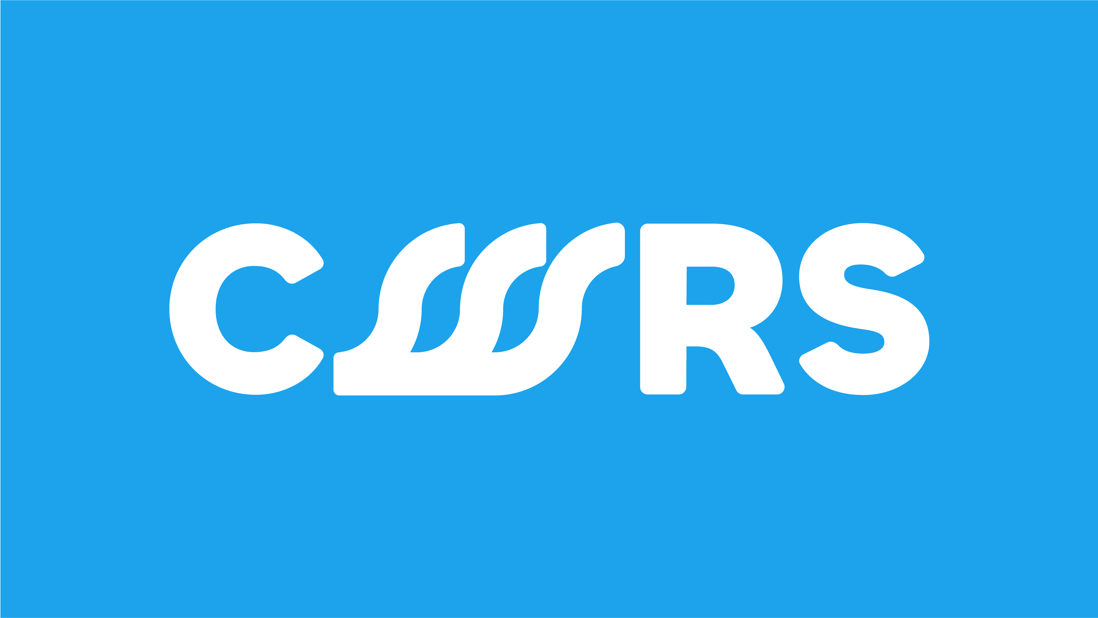
The Logo
The CWRS logo was designed to embody the brand’s core values of growth, collaboration, and sustainability. Its visual composition reflects these principles, creating a strong and meaningful identity.
At its core, the logo features a stylized ‘W’, symbolizing water, a key element of CWRS’s mission. Integrated within the design is a wave motif, representing the movement and transformation involved in water purification and environmental sustainability. This fluid yet structured approach reflects both the brand’s innovative solutions and its commitment to ecological balance.


